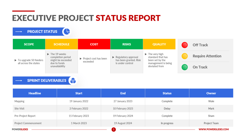
Developing project status visualizations for complex data using process improvement can greatly enhance the effectiveness and efficiency of your project management efforts. By utilizing various techniques and tools, you can create visually appealing and informative visualizations that help you better understand and communicate the status of your project. In this blog post, we will discuss the step-by-step process of developing project status visualizations for complex data using process improvement.
Step 1: Define Your Objectives and Goals
Before you start creating visualizations, it’s important to clearly define your objectives and goals. What specific information do you want to convey through the visualizations? Are you looking to track progress, identify bottlenecks, or highlight areas of concern? Defining your objectives will help you determine what data you need to collect and analyze, and what type of visualizations will be most effective in conveying the information.
Step 2: Collect Relevant Data
Collecting relevant and accurate data is crucial for creating meaningful project status visualizations. Identify the key performance indicators (KPIs) that are important for tracking the progress of your project. This may include metrics such as project timeline, budget, resource allocation, and task completion rates. Use data collection tools such as spreadsheets, project management software, or specialized data collection tools to gather the necessary data.
Step 3: Clean and Prepare the Data
Once you have collected the data, it’s important to clean and prepare it for visualization. Remove any duplicates, inconsistencies, or irrelevant data points that could skew the results. Organize the data in a structured format that is suitable for visualization. This may involve transforming the data into a tabular format or creating calculated fields to provide more context.
Step 4: Choose the Right Visualization Techniques
Selecting the appropriate visualization techniques is essential for effectively communicating complex data. There are various types of visualizations you can use, such as charts, graphs, dashboards, heatmaps, and flowcharts. The choice of visualization technique depends on the type of data you have and the insights you want to convey. For example, a Gantt chart may be suitable for showing project timelines, while a bar graph can effectively display resource allocation.
Step 5: Use Process Improvement Tools
Process improvement tools can help you identify areas of improvement and optimize your project management processes. Techniques such as Six Sigma, Lean, and Kaizen can help you streamline workflows, reduce waste, and enhance overall project efficiency. By integrating process improvement methodologies into your project status visualization efforts, you can ensure that your visualizations accurately reflect the progress and performance of your project.
Step 6: Incorporate Interactive Features
To make your project status visualizations more engaging and user-friendly, consider incorporating interactive features. Interactive dashboards, drill-down capabilities, and filters allow stakeholders to explore the data further and gain deeper insights. Interactive visualizations enable users to customize their views based on their specific needs, making the information more relevant and actionable.
Step 7: Test and Iterate
Before finalizing your project status visualizations, it’s important to test them with a diverse group of stakeholders. Gather feedback on the clarity, accuracy, and effectiveness of the visualizations. Make necessary adjustments based on the feedback and iterate on the design until you achieve the desired results. Regularly updating and refining your visualizations ensures that they remain relevant and valuable throughout the project lifecycle.
Step 8: Communicate Effectively
Creating project status visualizations is just the first step; effectively communicating the insights derived from the visualizations is equally important. Clearly explain the findings, trends, and implications to stakeholders through presentations, reports, or meetings. Use storytelling techniques to narrate the data and highlight key takeaways. Tailor your communication style to the preferences of your audience, whether they are project team members, executives, or clients.
Step 9: Monitor and Evaluate
Continuous monitoring and evaluation of your project status visualizations are essential for tracking progress and making informed decisions. Regularly update the visualizations with the latest data to ensure that stakeholders have access to real-time insights. Compare the actual project performance against the initial goals and objectives to identify any deviations and take corrective actions as needed.
In conclusion, developing project status visualizations for complex data using process improvement is a systematic approach that involves defining objectives, collecting relevant data, cleaning and preparing the data, choosing the right visualization techniques, incorporating interactive features, testing and iterating, communicating effectively, and monitoring and evaluating. By following these steps, you can create visually appealing and informative visualizations that help you better understand and communicate the status of your project, ultimately leading to improved project management outcomes.
Like this post? Buy my book, Workflows: How to Design, Improve and Automate High Performance Processes to start your process improvement journey.